Simbe Robotics

Project

Duration

Role

Responsive Wesbite

1 month

Sole UX Designer

Research

Wireframes

Prototype Testing

Simbe Robotics

Project

Duration

Role

Responsive Wesbite

1 month

Sole UX Designer

Research

Wireframes

Prototype Testing

Simbe Robotics

Project

Duration

Role

Responsive Wesbite

1 month

Sole UX Designer

Research

Wireframes

Prototype Testing

Simbe delivers market-leading product availability & price integrity, so you can improve store performance and labor efficiency.

Background

Simbe Robotics is a company that leverages robotics and AI to enhance retail operations and inventory management. Their primary product, Tally, is an autonomous robot that scans store shelves to help retailers detect problems such as out-of-stock items, pricing errors, and misplaced products.

Problem

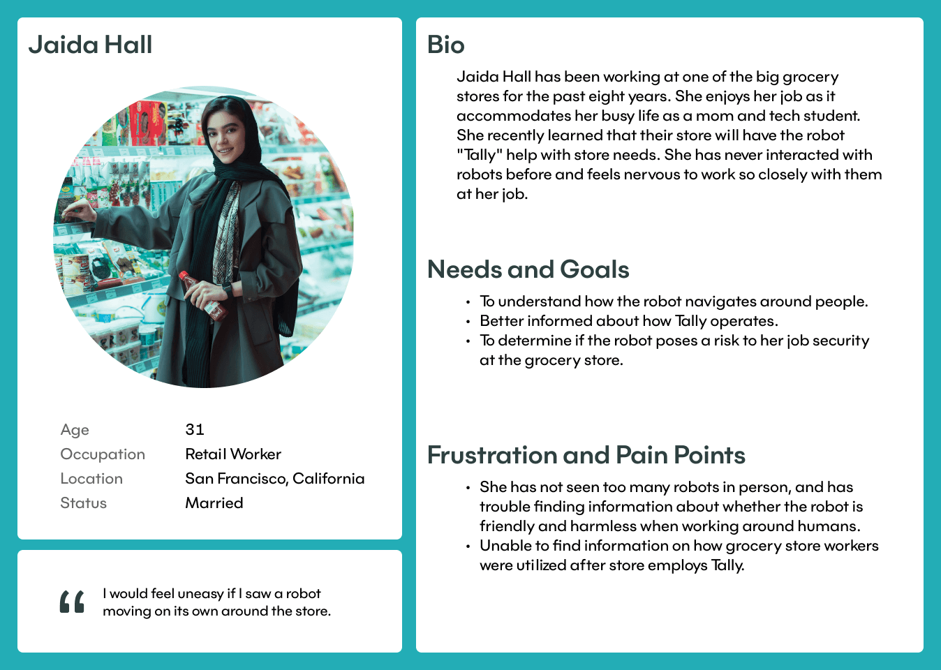
Not everyone understands how autonomous robots work, and some may fear job losses or be unsure how to interact with the robot. The website does not clearly explain how this robot helps grocery stores succeed, which can be frustrating for users unfamiliar with autonomous technology.

Solution

Include a tabbed interface for each store that uses Tally, providing information about the store, its status before and after incorporating Tally, and how employees are affected. Add pictures of people interacting with the robot.

Research

Research

Competitive Analysis

Competitive Analysis

I was curious to see how competitors present information about their robotic products, given that it's a subject many people aren't knowledgeable about and tends to have more negative than positive opinions. I explored three different competitor sites: Badger Technologies, Zippedi and Brain Corp.

User Interview

User Interview

I interviewed five users with the research objectives of assessing their ability to understand the product through self-exploration of the website, the time it takes them to grasp the concept, and their general opinions about robots in grocery stores.

Insights

Insights

Semi-Positive View

The overall average opinion about robots was somewhat positive, rated 6 out of 10.

Semi-Positive View

The overall average opinion about robots was somewhat positive, rated 6 out of 10.

Desire for Comprehensive Understanding

As users explored, their curiosity grew, and they sought a deeper understanding of how the robot works, though it took time to fully grasp its functions.

Desire for Comprehensive Understanding

As users explored, their curiosity grew, and they sought a deeper understanding of how the robot works, though it took time to fully grasp its functions.

Homepage Navigation Patterns

During the user interviews, I observed that people primarily explored the homepage vertically to learn about the robots and their capabilities.

Homepage Navigation Patterns

During the user interviews, I observed that people primarily explored the homepage vertically to learn about the robots and their capabilities.

Job Security Concerns

Some users expressed concerns about robots potentially taking over jobs in the future, fearing either losing their own jobs or that their employees might lose theirs.

Job Security Concerns

Some users expressed concerns about robots potentially taking over jobs in the future, fearing either losing their own jobs or that their employees might lose theirs.

Need for Demonstrated Impact

Users didn't recognize any of the East Coast stores that utilize Simbe’s Tally. They expressed a desire to see concrete examples of how Tally helps stores improve profits.

Need for Demonstrated Impact

Users didn't recognize any of the East Coast stores that utilize Simbe’s Tally. They expressed a desire to see concrete examples of how Tally helps stores improve profits.

Limited Direct Encounters

Few users had seen autonomous robots in person before, and some expressed nervousness about approaching one.

Limited Direct Encounters

Few users had seen autonomous robots in person before, and some expressed nervousness about approaching one.

Define

Key Points

Semi-Positive View

Job Security Concerns

Lack of Brand Recognition

Limited Direct Encounters

Homepage Navigation Patterns

Desire for Comprehensive Understanding

Pov and Hmw

Understanding my users' needs, I created my POV and HMW statements to guide the development of design solutions. These statements were chosen to address users concerns.

Pov

I want to help people better understand how Tally benefits companies without compromising worker needs, as they are concerned about the impact of robots on their jobs.

Hmw

Hmw

How might we show more efficiently that Tally wouldn’t sacrifice the need of people, who are concerned about impact of using a robots at their job?

How might we show more efficiently how Tally benefit companies?

Personas

Personas

Personas

Persona 1

Persona 1

Persona 2

Persona 2

Creative Thinking

To ensure the design solution best fits our users' needs, I created a survey and tested it out with 5 participants to evaluate the top 4 design solutions and determine which one users preferred the most.

To ensure the design solution best fits our users' needs, I created a survey and tested it out with 5 participants to evaluate the top 4 design solutions and determine which one users preferred the most.

Chosen Solution

Chosen Solution

Implement a tabbed interface with image carousel on the homepage, allowing users to click on grocery store logos to view a brief summary, including store locations, Tally's positive impact on workers and customers, and photos of Tally in action, such as taking selfies with people.

Implement a tabbed interface with image carousel on the homepage, allowing users to click on grocery store logos to view a brief summary, including store locations, Tally's positive impact on workers and customers, and photos of Tally in action, such as taking selfies with people.

Why? Research showed that users prefer quick insights on companies using Tally's improvements, directly on the homepage. Interviews revealed strong interest in Tally’s interactions with people. A tabbed interface on the homepage helps, as users frequently scroll there to learn about Tally's impact on workers and company success, providing key info where they expect it.

Why? Research showed that users prefer quick insights on companies using Tally's improvements, directly on the homepage. Interviews revealed strong interest in Tally’s interactions with people. A tabbed interface on the homepage helps, as users frequently scroll there to learn about Tally's impact on workers and company success, providing key info where they expect it.

Features & Prioritization

Based on users' needs and goals, I developed and prioritized key features for the tabbed interface implementation.

Must Haves

Video Overview

Users can visually see Tally in action at specific grocery stores, providing a clear understanding of its role. Video content helps users grasp Tally’s functionality quickly.

Video Overview

Users can visually see Tally in action at specific grocery stores, providing a clear understanding of its role. Video content helps users grasp Tally’s functionality quickly.

About the Store

Provide a brief summary of each grocery store for users unfamiliar with them, allowing them to understand the store’s background.

About the Store

Provide a brief summary of each grocery store for users unfamiliar with them, allowing them to understand the store’s background.

Employee Responsibilities


Explain how store employees' roles have evolved post Tally, demonstrating that workers remain essential despite Tally's presence.

Employee Responsibilities

Explain how store employees' roles have evolved post Tally, demonstrating that workers remain essential despite Tally's presence.

Tally 's Impact

Display measurable outcomes that Tally has contributed to, such as store performance improvements and effects on employee roles.

Tally 's Impact

Display measurable outcomes that Tally has contributed to, such as store performance improvements and effects on employee roles.

Store Needs & Tally's Abilities

The image carousel with highlight the store's needs before Tally's introduction and how Tally can address those challenges.

Store Needs & Tally's Abilities

The image carousel with highlight the store's needs before Tally's introduction and how Tally can address those challenges.

Tally & People Photos

Showcase images of Tally interacting with employees and customers to ease concerns about autonomous robots and make them feel more relatable.

Tally & People Photos

Showcase images of Tally interacting with employees and customers to ease concerns about autonomous robots and make them feel more relatable.

Task Flow

Task Flow

Key

Key

Task Flow

Task Flow

Find a short description of BJ’s (Retail Store).

Find a short description of BJ’s (Retail Store).

This reflects users who are unfamiliar with these retail stores and want to also learn Tally’s impact.

Design

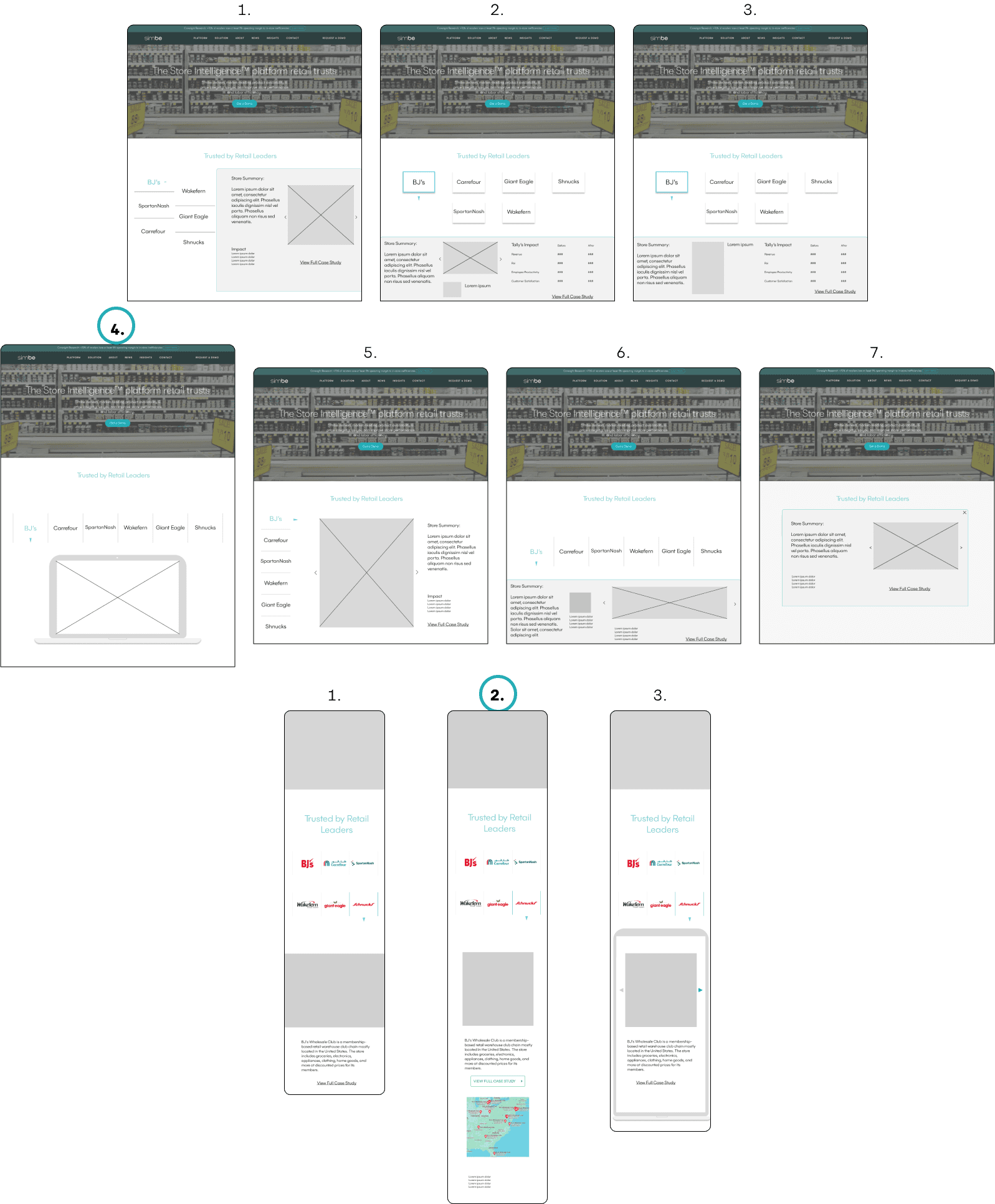
Low-Fidelity Wireframes

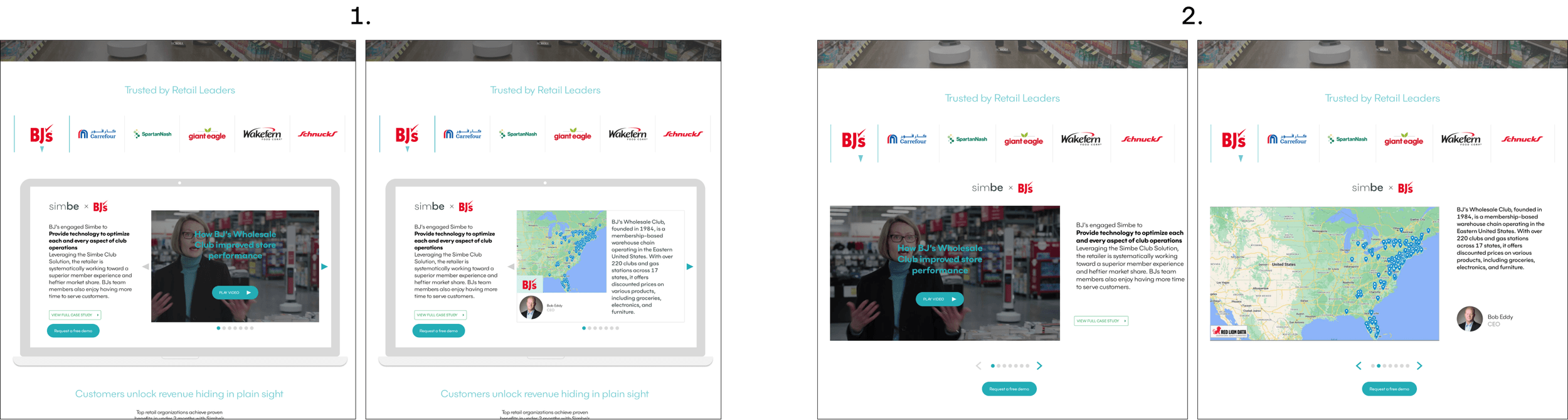
I began sketching different designs and chose design number 4 (mobile number 2). I asked 3 people for their opinions, and they liked how the information was framed. There is also a similar iPad design on Simbe’s site that could help maintain consistency.

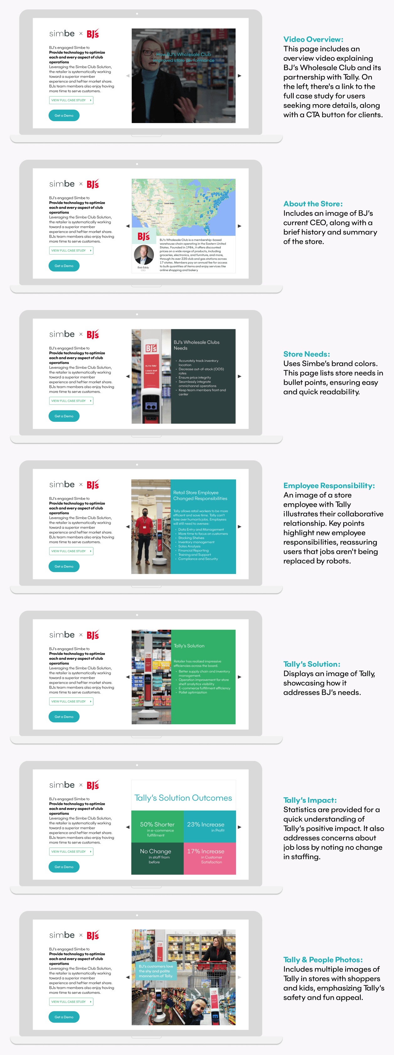
High-Fidelity Wireframes

By understanding our users' needs, I began creating high-fidelity designs for the tabbed interface. I later conducted several user tests and made multiple iterations based on the feedback. Below are screens of the high-fidelity tabbed interface.

Testing

High-Fidelity User Testing

To ensure the tabbed interface met user needs and provided relevant information, I conducted user testing with 9 participants. Four sessions were done via video chat, where I observed actions and thought processes, while the other five were tested through "Maze."

Task Flow: Find a short description of BJ’s (Retail Store).

Results

Results

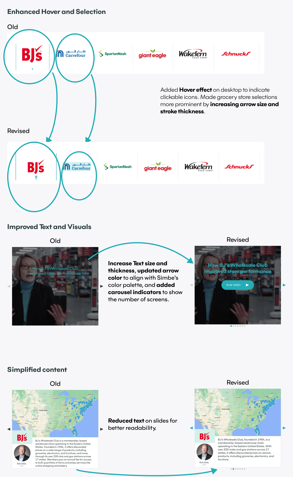
Users wanted to see the total number of slides in the tabbed navigation.

Blue icons and text should be more prominent for better visibility.

The user flow scored 7/10 for ease of use.

Recommended shortening or breaking up text for better readability.

Suggested adding hints to indicate that store logos are clickable.

Users found the layout intuitive and easy to follow.

Iterations

High-Fidelity Survey

I wanted to further explore my design to find even better ways to present the information in a user-friendly manner. Since I had a good understanding of what users preferred, I created several new designs based on the previous high-fidelity wireframes to look for improvements.

Results

Results

Wireframes 1 and 2 were the two favorites.

Users liked the iPad layout for its clear focal point.

Users preferred having one paragraph per image in the carousel.

Iterations

I decided to combine the designs, knowing that less text on the screen helps with focus. This also gave me the opportunity to create more white space on each slide.

Final Thoughts

Reflection & Next Steps

This was a unique project that taught me a lot about the subject matter. With more UX design experience, I enjoyed practicing different design process steps and honing my skills.

Insight

I appreciated incorporating A/B testing into this project. By adding surveys to the design process, I created a solution that better catered to user needs.

Challenges

The main challenge was learning a subject I wasn’t familiar with. However, I found the deep dive into user research engaging and fulfilling. I now feel like quite the robotics expert.

Things I Could Have Done Differently

I would have tested mobile prototypes on users' phones from the start instead of on computers. Testing on phones provides a more accurate representation of how the screens will be used, allowing for earlier adjustments.

Next Steps

Moving forward, I would test the design with a new set of users unfamiliar with robotics. Although I tried various users, testing with those with no prior knowledge would offer fresh insights into the design’s functionality.

©2024 Philip Chao. All Rights Reserved

©2024 Philip Chao. All Rights Reserved

©2024 Philip Chao. All Rights Reserved